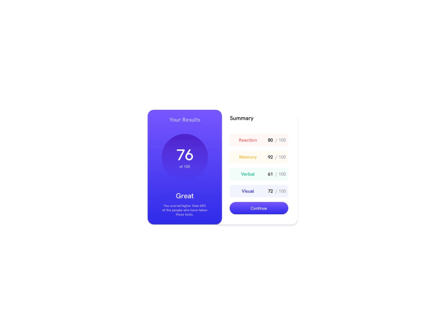


Design comparison
SolutionDesign

Solution retrospective
I didn't know how to make the one-side box shadow and my media queries are not the best so what is the best practice
Community feedback
Please log in to post a comment
Log in with GitHub
Join our Discord community
Join thousands of Frontend Mentor community members taking the challenges, sharing resources, helping each other, and chatting about all things front-end!
Join our Discord