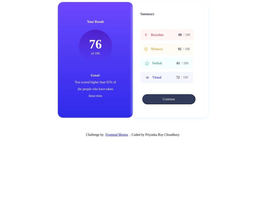
Design comparison
Solution retrospective
Hello
I hope this message finds you well.
I am pleased to share that I have completed my first project with FrontEnd Mentor, focusing on the "Results Component Summary" challenge.
Please feel free to share your feedback for the following:
-
I am keen to gain insights into the responsiveness of my design. I would greatly appreciate your guidance if there are any areas where my design can be enhanced for improved responsiveness.
-
Furthermore, I would be immensely grateful for your input on the structure of my code. I am eager to know where improvements can be made in this regard.
-
Any other feedback will be greatly appreciated.
Your considered feedback is of great importance to me, and I genuinely look forward to your expert insights.
Thank you for your time and attention.
Warm regards,
Priyanka
Community feedback
- @Kulyk-VolodymyrPosted about 1 year ago
- You can center a component by applying
body { display: flex; align-items: center; justify-content: center; flex-direction: column; }-
To separate
.cardand.attributionyou can set themargin-topproperty to.attributionand not use<br>tags. -
For the active state for the 'Continue' button you can change
.button:activeto.button:hoverand addcursor: pointer;. -
Try to place the selectors in
style.cssin the same order as the tags inindex.html. This will be useful for refactoring.
I wish you success in the next challenges!
Marked as helpful1@PriyankaRC16Posted about 1 year ago@Kulyk-Volodymyr Thank you very much for your feedback.
0
Please log in to post a comment
Log in with GitHubJoin our Discord community
Join thousands of Frontend Mentor community members taking the challenges, sharing resources, helping each other, and chatting about all things front-end!
Join our Discord
