Submitted about 3 years ago
Responsive Page using HTML and CSS
@DamnItAzriel
Design comparison
SolutionDesign
Solution retrospective
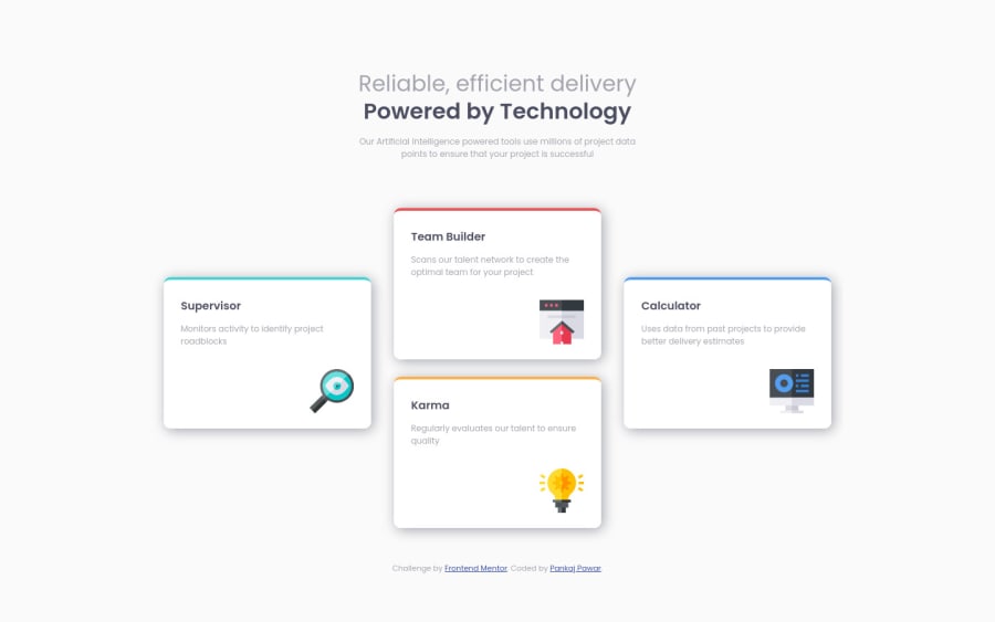
Hello, I would like to have inputs about how can I make this better. I struggle to get the 4 blocks in a plus sign for desktop version but I managed to have it. Would love inputs on overall webpage. Thanks in advance.
Community feedback
- @fidellimPosted about 3 years ago
Hi @DamnItAzriel ,
Great job finishing the project! It looks great on desktop and mobile devices. Some suggestions I would like to share are of the following:
- use alt on images. If they are decorative,
alt=""
would suffice. Include an aria-label which isaria-hidden=" true"
. Adding aria-hidden="true" to an element removes that element and all of its children from the accessibility tree. This can improve the experience for assistive technology users. - you can add some semantic tags on your markdown to give more meaning and other people who are going to read your code can have an idea of what the content would be.
I hope these help :)
Marked as helpful1 - use alt on images. If they are decorative,
- @DamnItAzrielPosted about 3 years ago
Thanks very much for the feedback. I will keep this in mind.
0
Please log in to post a comment
Log in with GitHubJoin our Discord community
Join thousands of Frontend Mentor community members taking the challenges, sharing resources, helping each other, and chatting about all things front-end!
Join our Discord