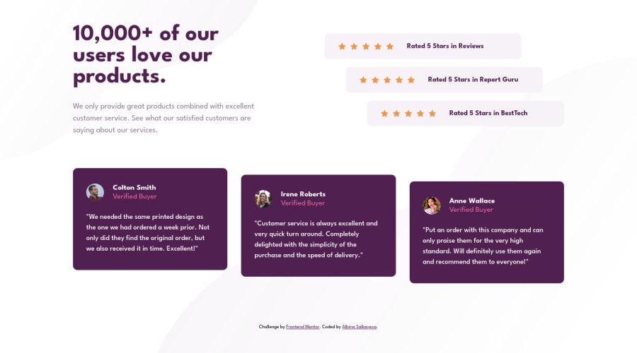
Not Found
Not Found
Not Found
Not Found
Not Found
Not Found
Not Found
Not Found
Not Found
Not Found
Not Found
Not Found
Not Found
Not Found
Not Found
Not Found
Not Found
Not Found
Not Found
Not Found

Submitted

Responsive page using Grid, Sass

Albina S 130

@albina0104

Desktop design screenshot for the Social proof section coding challenge

This is a solution for...

  • HTML
  • CSS
1newbie
View challenge

Design comparison


SolutionDesign

Solution retrospective


I used several things for the first time:

  • Sass
  • Grid (tried to use it everywhere, but in one place I had to use Flexbox)
  • NPM packages (to compile Sass and other things)
  • GitHub Actions (wrote a config)

I would like to know if I used all that appropriately :)

Community feedback

T
Grace 29,310

@grace-snow

Posted

Why is almost everything a div?! 😭

You need to use meaningful elements.

For example, testimonials could be a figure with figcaption and blockquote

You should never have text in divs or spans alone.

As a general principle you also should avoid having empty divs. Consider using a pseudo element for decorative backgrounds like those stars.

On your next project make sure you work mobile first. Break the desktop first habit you've got ASAP

Marked as helpful

2

Albina S 130

@albina0104

Posted

@grace-snow Thank you! I will check what are all possible semantic elements and will try to remember to choose appropriate ones!

And I will try to use pseudo elements next time.

In this particular project, I could not imagine how I would transform a mobile version to a desktop one, as the desktop version is more complex. Also I've read on the internet that sometimes we can do desktop first, depends on the situation.

0

Please log in to post a comment

Log in with GitHub
Discord logo

Join our Discord community

Join thousands of Frontend Mentor community members taking the challenges, sharing resources, helping each other, and chatting about all things front-end!

Join our Discord