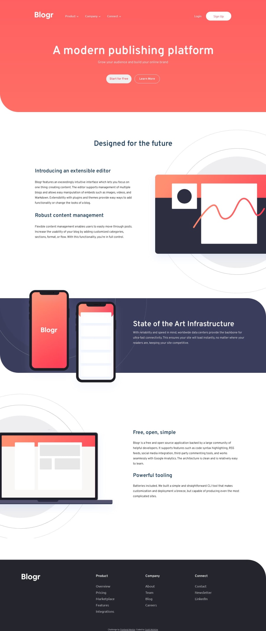
Responsive page using Grid CSS, SASS and vanilla JS
Design comparison
Solution retrospective
I've spent a lot of time on this challenge, but I'm going to stop tweaking and just submit it as an imperfect solution. I've learned a great deal about building a website like this from scratch.
Some of the difficulties I had where seemingly simple things like getting the positioning of background images just right. I tried to challenge myself with this one using BEM and SASS, which I found to be a great pairing of tools.
I was happy with the javascript I wrote to get the mobile menu to work, but I feel like I have a lot to learn still. I don't think my solutions are very efficient, but for my current skillset, I'm happy I was able to find a solution that worked.
I struggled with GitHub Pages too, I found that pages wouldn't display my background images. This was confusing because the the pages work fine in my localhost. I came up with a workaround where I created a branch for Github Pages that was separate from my Main branch. I'd then go in and manually remove the /assets/ directory from the background url.
This problem is ultimately what made me decide to stop trying to refine the screenshot and get it to be perfect. I'm going to take the experiences I've had working with this challenge and try to apply them to future challenges.
Community feedback
Please log in to post a comment
Log in with GitHubJoin our Discord community
Join thousands of Frontend Mentor community members taking the challenges, sharing resources, helping each other, and chatting about all things front-end!
Join our Discord
