Design comparison
Community feedback
- @denieldenPosted almost 2 years ago
Hello Pedro, You have done a good work! 😁
Some little tips to improve your code:
- use
maintag to wrap the card and improve the Accessibility but not as a container of that one element - also you can use
articletag instead of a simpledivto the container card for improve the Accessibility - remove all
marginfromqr-containerclass because with flex they are superfluous - use
min-height: 100vhto body instead ofheight, otherwise the content is cut off when the browser height is less than the content - instead of using
pxuse relative units of measurement likerem-> read here
Keep learning how to code with your amazing solutions to challenges.
Hope this help 😉 and Happy coding!
Marked as helpful1@pedrosenavPosted almost 2 years ago@denielden Hello Deniel, really appreciate those tips!! I usually get a little lost when using other semantic divs other than
sectionandmain. I'll work to fully using realtive units, is a new ground for me now. Those little details certainly will improve my code, one again, thank you very much!1 - use
- @rachit0706Posted almost 2 years ago
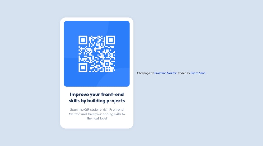
Congratulations for completing the challenge! . Everything looks great but the only issue I found was that you forgot to use
flex-direction: column;inside the body tag. This will properly center the component in the page and will match the design.Marked as helpful1@pedrosenavPosted almost 2 years ago@rachit0706 Oh yes, I commited the version without this fix, now it is working properly. Thanks for the tip!
0
Please log in to post a comment
Log in with GitHubJoin our Discord community
Join thousands of Frontend Mentor community members taking the challenges, sharing resources, helping each other, and chatting about all things front-end!
Join our Discord
