

Design comparison
SolutionDesign

Community feedback
- P@TurtlewordsPosted 23 days ago
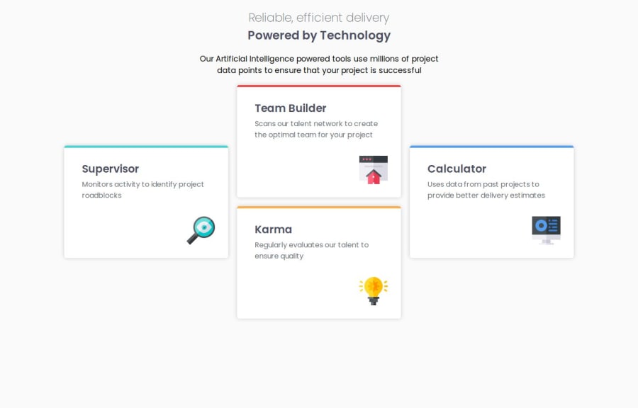
The page looks nice but could use a few improvements. The resizing of the cards could be contained so that they don't get too large or small. It appears that the tablet layout was not included in your solution. The solution is a bit cluttered, and could benefit from increasing space between elements. Great job on the box shadows!
0

Please log in to post a comment
Log in with GitHubJoin our Discord community
Join thousands of Frontend Mentor community members taking the challenges, sharing resources, helping each other, and chatting about all things front-end!
Join our Discord