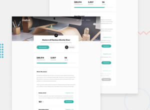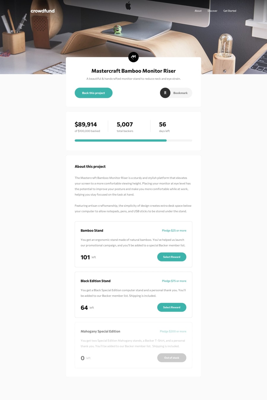
Design comparison
SolutionDesign
Solution retrospective
All sugestions are welcome!!
Community feedback
- @tedikoPosted over 3 years ago
Hello, Luiz Claudio Lopes! 👋
Congrats on finishing another challenge! 🎉 Your solution looks very good and also responds well. Here's my few tips:
- There is no need to use aria-label on
.logoelement when your image has alternative text. But you should changealttext to somethig more descriptive like "crowdfund - home page". - Add
:focuspseudo class to interactive elements like anchors, buttons etc. Useoutlineproperty to make your website more accessible to keyboard users. Focusable elements like anchor, buttons or inputs they have applied default:focuspseudo class withoutlineproperty. These default styles are subtle and hardly visible tho. Furthermore every browser has a slightly different default style for the outline, so you probably want to change the default style. Read more about why we should change focus styles. - Not sure how advanced you're with JavaScript but.. After opening a modal with my keyboard the focus isn't in modal and I can't select modal options right away. Take a look at this great solution (link). Anna implemented focus trap in her project to - in short - prevent focus to go outside the modal once the modal is opened.
Good luck with that, have fun coding! 💪
2 - There is no need to use aria-label on
Please log in to post a comment
Log in with GitHubJoin our Discord community
Join thousands of Frontend Mentor community members taking the challenges, sharing resources, helping each other, and chatting about all things front-end!
Join our Discord
