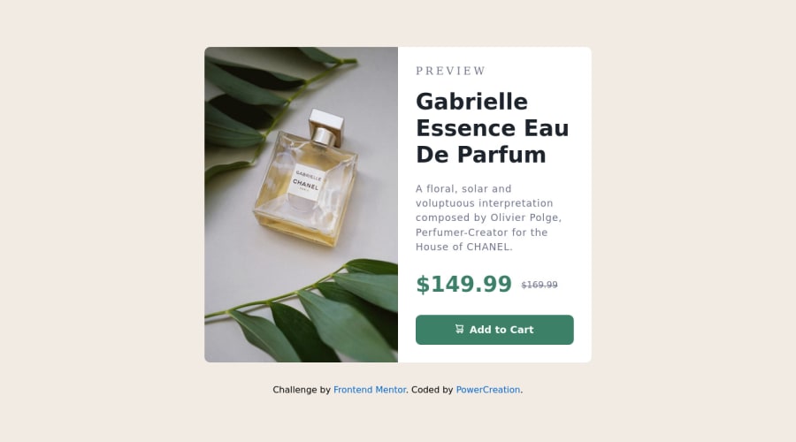
Design comparison
Solution retrospective
I would love to get feedback about best practices and how i can improve my code. Have a nice day!
Community feedback
- @xavCSPosted over 2 years ago
Hey, nice job - I do have a few comments on your code that could hopefully help you out.
<div class="card-content">
      <h3 class="desc">PREVIEW</h3>
      <h1 class="title">Gabrielle Essence Eau De Parfum</h1>
In this codeblock you've started with a h3 then gone to a h1, I would emphasise that you try to stick to the order of headers, where h1 is top level and h3 is 2 sub headings lower. This is more of an accesibility thing for people in general and more specifically screen readers! Using headers out of order breaks their semantic meaning so you'd really rather avoid that. For styling purposes, just resize and redesign with CSS.
Small MDN docs page on headings https://developer.mozilla.org/en-US/docs/Web/HTML/Element/Heading_Elements
Another thing is your button, for this small project it's fine but you can imagine it would probably lead somewhere to buy the product, so using an anchor tag would be better to get that
hrefin for effective browsingYour CSS is nice and tidy which is always a plus! Hope this helped
Marked as helpful1 - @joana-trotsPosted over 2 years ago
Nice work! I see small design inconsistencies in the fonts, try this styles: body {font-family: "Montserrat", sans-serif;} and h1, .prices {font-family: "Fraunces", serif;}, and also font-weight:1500 is not working (900 is a max 😁). And you can put another image for small screen (it's in the archive). Hope it was helpful, keep it up! 👍
Marked as helpful0@ristoranteQFPosted over 2 years ago@joana-trots I did not know why the font was not working. Thank you for your feedback!
0
Please log in to post a comment
Log in with GitHubJoin our Discord community
Join thousands of Frontend Mentor community members taking the challenges, sharing resources, helping each other, and chatting about all things front-end!
Join our Discord
