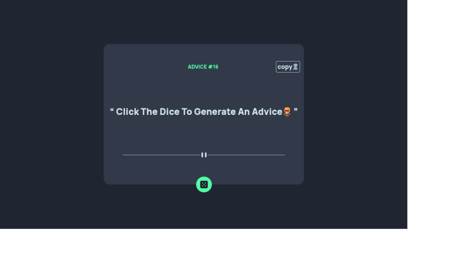
Design comparison
Community feedback
- @shashreesamuelPosted about 3 years ago
Hey Icekid35, good job completing this challenge. Keep up the good work
Your solution doesn't match the design in terms of the following
-
Your card needs to be a bit wider
-
The background color of the card should match the color specified in
style-guide.mdfile -
The dice needs some padding using
padding.
In terms of accessibility issues
-
Buttons must have text, you can fix this by specifying the
aria-labelattribute -
html tag must have the
langattribute like this<html lang="en"> -
Wrap all your content between
<main>tags to get rid of the rest of accessibility issues
In terms of the validation errors then once you fix the accessibility issues your validation errors should disappear
I hope this helps Cheers
Happy coding 👍
Marked as helpful0 -
- @msuryaditriputraRPosted about 3 years ago
Hi Icekid35 👋
You have amazing work.. Good job 🙌 then adding a copy feature and adorable icons are an impressive idea. Nice! 🤘
However, i have some suggestions for u
- You should wrap the advice title with
h1to fix your accessibility issue do you have. Page should contain a level-one heading - Add some
paddingin the copy element and addborder-radiustoo. - For Divider, actually you can use the image assets but it's no big deal. Nice try to build your own divider style 😁
I see you have fixed your code according to the suggestion of the previous comment, but you forget to Generate a new report. Please update them 🛠
I hope this helps. Keep it up your good work 🔥💥
Happy Coding ☕
0 - You should wrap the advice title with
Please log in to post a comment
Log in with GitHubJoin our Discord community
Join thousands of Frontend Mentor community members taking the challenges, sharing resources, helping each other, and chatting about all things front-end!
Join our Discord
