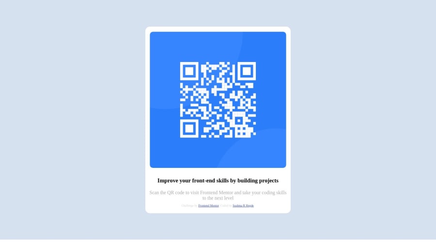
Design comparison
Solution retrospective
I found it difficult to position box in the center vertically ( distributing space equally between top and bottom. float didn't help nor margin ( its helped for horizontal centering ).
Community feedback
- @leoemnPosted over 1 year ago
hey, just made some changes in your css. this should help you put your box in center
body {
    height: 99vh;
    margin: auto;
    display: flex;
    align-items: center;
    justify-content: center;
    background-color: hsl(212, 45%, 89%);
}
I added
display: flex; align-items: center; justify-content: center; to make your container in the center. after that.container { width: 60%; height: 50%; max-width: 30rem; margin: auto auto; background-color: white; border-radius: 15px; padding: 10px; }changed the width and height of container.
removed all the styling from the big-container as we do not need them at this point. it will fix your problem. hope this solution is useful for you.
0 - @YahyobekRahimovPosted over 1 year ago
You have done a good job. But there are some things you have to keep in mind.
- If an image is an item of a flexbox, it takes up the full width the container. So you should consider giving the image a width.
- You also need to give the description part another width, so that it matches the width.
- Make sure to keep the reference to yourself and frontendmentor outside the main part of the project next time.
- Note that the texts in h3 and p elements have different font-sizes.
By the way, to center a flex-item, you should give the container "justify-content: center; (along the main axis) align-items: center; (along the other axis)
0@sushmavyPosted over 1 year ago@YahyobekRahimov Thanks a lot. I will retry. Didn't understand your 3rd point.
0
Please log in to post a comment
Log in with GitHubJoin our Discord community
Join thousands of Frontend Mentor community members taking the challenges, sharing resources, helping each other, and chatting about all things front-end!
Join our Discord
