Submitted over 2 years ago
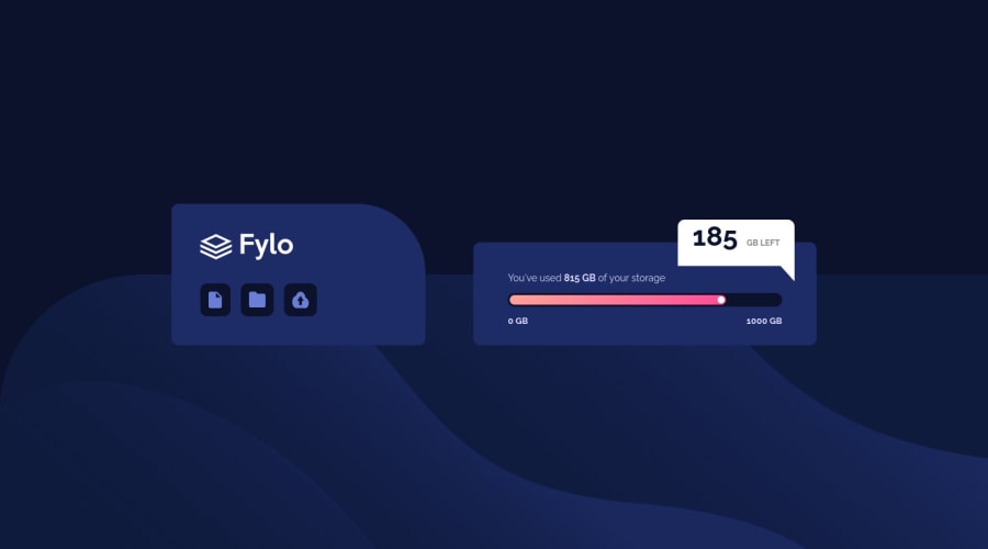
Responsive page using flex, absolute and relative positioning
@Lwmeek
Design comparison
SolutionDesign
Solution retrospective
Would love feedback on how to get the bottom left of the message bubble to have a rounded border like the top two? And a way to position the 185 and the GB LEFT better in the bubble as shown in the design?
Community feedback
- @Babacar-CissPosted over 2 years ago
hi dear, first : i suggest you to use clip-path css : https://bennettfeely.com/clippy/ there is a website which you can test. second : display : flex align-item : center ; justify-content : center. for the rest play around with margins.
hope it will be helpfull for you !
Marked as helpful0
Please log in to post a comment
Log in with GitHubJoin our Discord community
Join thousands of Frontend Mentor community members taking the challenges, sharing resources, helping each other, and chatting about all things front-end!
Join our Discord
