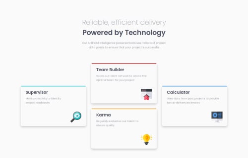
Responsive page using CSS Grid and Flexbox

Solution retrospective
I think the page is looking good and responsive. Just a few lines of HTML and CSS. I am proud of doing it in just a few hours. Next time, maybe I'll try to use areas for CSS Grid, but I just thought that they were not necessary this for this project.
What challenges did you encounter, and how did you overcome them?The main problem was changing the order of the cards for desktop design. I just followed a mobile first design, so this part was easy. The desktop design was a bit tricky, but not very difficult. So, overall it wasnt' as harda as I thougth.
What specific areas of your project would you like help with?I would say the shadows were not enough good if they are compared with the design, so a bit of help in how to make the shadows perfect according with the design.
Please log in to post a comment
Log in with GitHubCommunity feedback
No feedback yet. Be the first to give feedback on FranciscoDavidCampuzanoMelgarejo's solution.
Join our Discord community
Join thousands of Frontend Mentor community members taking the challenges, sharing resources, helping each other, and chatting about all things front-end!
Join our Discord