Submitted almost 2 years ago
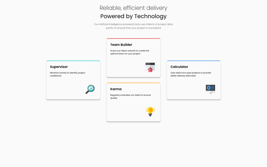
Responsive page using CSS Grid and Flexbox
@romariobarbosa
Design comparison
SolutionDesign
Community feedback
- @VCaramesPosted almost 2 years ago
Hey there! 👋 Here are some suggestions to help improve your code:
- The
mainelement should only ⚠️ be wrapping the card section since that is the main content of your page.
- The intro heading and paragraph ⚠️ should be wrapped inside a
headerelement.
- The “icons” in this component are purely decorative. ⚠️ Their
alt tagshould be left blank to hide them from assistive technology.
More Info:📚
https://www.w3.org/WAI/tutorials/images/
- It is best practice ✅ to use,
classesfor styling purposes, while usingidssolely for JavaScript.
- There is no need to have separate stylesheets ⚠️as it can affect site performance. Instead have on singles stylesheet ✅.
- To properly center ✅ your content to your page, you will want to add the following to your
body(this method uses CSS Grid):
body {
    min-height: 100vh;
    display: grid;
    place-content: center;
}
More Info: 📚
If you have any questions or need further clarification, feel free to reach out to me.
Happy Coding! 😈♥️👾
0@romariobarbosaPosted almost 2 years ago@vcarames Thanks! I will try to improve my code following your tips. Please continue to help beginners! That's really good.
1 - The
Please log in to post a comment
Log in with GitHubJoin our Discord community
Join thousands of Frontend Mentor community members taking the challenges, sharing resources, helping each other, and chatting about all things front-end!
Join our Discord
