Responsive page using CSS Grid and Flexbox.


Design comparison

Solution retrospective
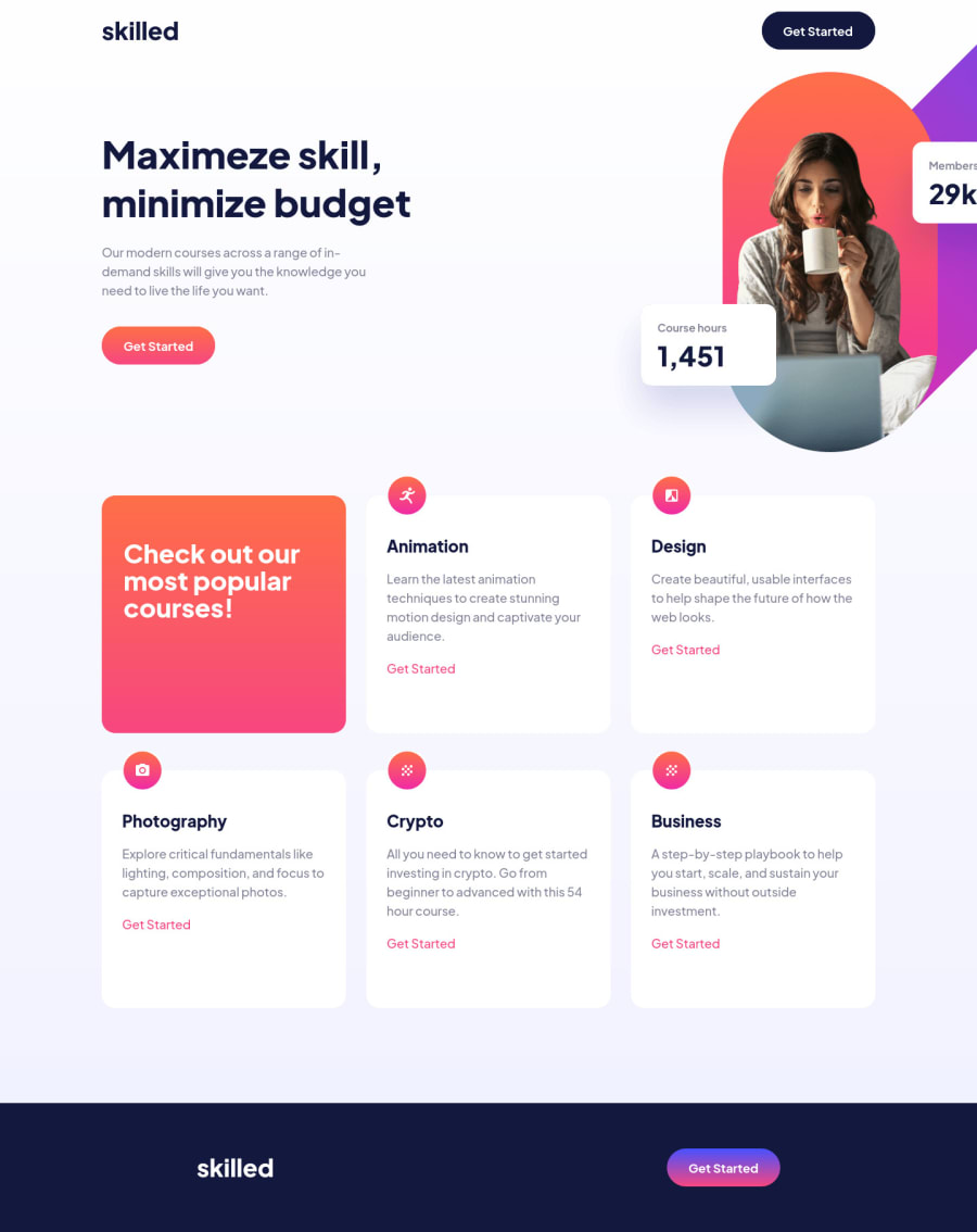
Hello, this was my solution for the Skilled e-learning landing page challenge. I used CSS Grid and Flexbox for positioning and alignment of the elements. I tried to use the BEM methodology in the HTML.
I had a lot of difficulty in correctly positioning the main image, so in the end I opted to use absolute positioning together with display grid and the transform property. I couldn't achieve good responsiveness with this image in some breakpoints, so I would appreciate any tips and suggestions on how to make the image width change at certain breakpoints and other alignment methods that are better than absolute positioning.
Community feedback
Please log in to post a comment
Log in with GitHub
Join our Discord community
Join thousands of Frontend Mentor community members taking the challenges, sharing resources, helping each other, and chatting about all things front-end!
Join our Discord