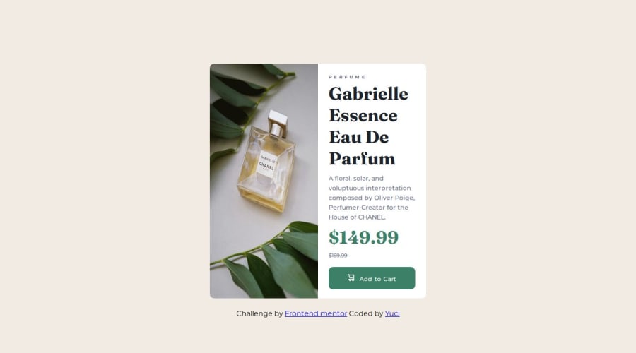
Design comparison
Solution retrospective
I'm proud of being able to use the grid property, and also being able to display image while hiding subsequent ones and vice versa.
What challenges did you encounter, and how did you overcome them?The challenge of making the image responsive on larger screens and the body padding.
What specific areas of your project would you like help with?I'd like help on how to make images responsive.
Community feedback
- @danielmrz-devPosted 6 months ago
Hello there!
Congrats on completing the challenge! β
Your project looks great!
I have a suggestion about your code that might interest you:
π You can use the
<picture>
tag when you have different versions of the same image.Using the
<picture>
tag will help load the correct image to the user's device, saving bandwidth and improving performance.Example:
<picture> <source media="(min-width: 768px)" srcset="{desktop image path here}"> <img src="{mobile image path here}" alt="{alternative text here}"> </picture>
I hope this helps!
Other than that, excellent work!
Marked as helpful1@Yu-ciePosted 6 months agoHello @danielmrz-dev thanks for the review and the suggestion. I'll surely try this out. Thanks!
1 - @0xabdulkhaliqPosted 6 months ago
Hello there π. Congratulations on successfully completing the challenge! π
- I have a suggestion regarding your code that I believe will be of great interest to you.
CSS π¨:
- Looks like the component has not been centered properly. So let me explain, How you can easily center the component without using
margin
orpadding
.
- We don't need to use
margin
andpadding
to center the component both horizontally & vertically. Because usingmargin
orpadding
will not dynamical centers our component at all states
- To properly center the component in the page, you should use
Flexbox
orGrid
layout. You can read more about centering in CSS here π.
- For this demonstration we use css
Grid
to center the component.
body { min-height: 100vh; display: grid; place-items: center; }
- Now remove these styles, after removing you can able to see the changes
body { margin: 20px 3%; } @media only screen and (min-width: 1024px) and (max-width: 1439px) { body { padding: 10% 25%; } #container { margin-top: 5%; } }
- Now your component has been properly centered
.
I hope you find this helpful π Above all, the solution you submitted is great !
Happy coding!
Marked as helpful0 - @R3ygoskiPosted 6 months ago
Hello @Yu-cie, congratulations on completing the challenge.
Regarding your question about image responsiveness, I believe you're asking about how to switch from a mobile image to a desktop image, right? If so, you can achieve this using the <picture> element, as shown in the example below:
<picture> <source media="(min-width:650px)" srcset="img_pink_flowers.jpg"> <source media="(min-width:465px)" srcset="img_white_flower.jpg"> <img src="img_orange_flowers.jpg" alt="Flowers" style="width:auto;"> </picture>
Link: W3School - Picture Tag
This way, you establish in which @media query you want it to appear.
Now, a tip regarding your HTML: I noticed that it's not very semantic. I recommend using semantic HTML as it not only helps with SEO but also greatly improves accessibility. I'll show you two sections that could be changed:
<div id="container">
could be changed to<main>
, as this is where the main content of your page is, and also because there should always be a<main>
after a<body>
.<div id="details">
could be changed to<article>
, as this section is self-explanatory and doesn't depend on the context of the page to make sense.
Again, congratulations on completing your challenge! Keep practicing and improving. If you have any questions, please comment below, and I'll try to help as best as I can.
Marked as helpful0@Yu-ciePosted 6 months agoHello @R3ygoski, thanks for the feedback and correction. Thanks also for the example on the <picture> element. Next time would definitely be better!
1
Please log in to post a comment
Log in with GitHubJoin our Discord community
Join thousands of Frontend Mentor community members taking the challenges, sharing resources, helping each other, and chatting about all things front-end!
Join our Discord