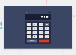
Design comparison
Solution retrospective
I would like to know how to make my code cleaner. I accept feedbacks!! Thanks
Community feedback
- @pikapikamartPosted about 3 years ago
Hey, really great work on this one. Desktop layout looks really great, it is responsive as well.
Some suggestions on the site would be:
- Theme toggle works but only limited for mouse users. Using
divfor an interactive component is not really great since you are excluding lots of users. For this one, a proper markup would be to use a 3 radio buttons, inside afieldsetwith alegendwhere the value is thethemekeyword:
<fieldset>
  <legend> theme </legend>
  set of radio buttons with label on them
</fieldset>
I haven't tackled this challenge so I can't give my own reference for this, but have a look at Agata's solution on this one. See the markup usage and you can just see the general approach on this as accessibility is really focused in here.
- When wrapping a text-content do not just use
divto wrap it, use meaningful element like aptag if it just a regular text or heading tag if it is an heading. - I don't really have lots of review for this challenge to be honest. But a great idea to implement is the use of arrow keys to choose the calculator buttons, this way it will be lot of easier as well.
I won't make the review long since on Agata's solution, you will lots of great ideas to implement and just take in general. Have a great look at those and again, great job on this one.
Marked as helpful0 - Theme toggle works but only limited for mouse users. Using
Please log in to post a comment
Log in with GitHubJoin our Discord community
Join thousands of Frontend Mentor community members taking the challenges, sharing resources, helping each other, and chatting about all things front-end!
Join our Discord
