

Design comparison
SolutionDesign

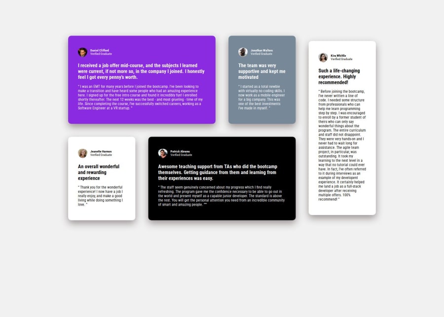
Community feedback
- P@GentleHorsePosted 10 days ago
The result is close to the design and also the app is responsive for different size of screen, so good job! However there are some points which you could improve;
- You use "Roboto Condensed" as the font, but in the design, "Barlow Semi Condensed" is used.
- You forgot to add the "bg-pattern-quotation.svg" image to the first card. You can easily position the image with set "position" property of the parent ("card") to "relative", and that of the child (image) to "absolute", and set "top" & "left" properties properly. And by using " visibility" property, you can hide the image especially for mobile screens.
- You added margins to each "card" control the gap of grid partially, but you could also control "horizontal gap" & "vertical gap" at the same time with passing two values to "gap" property of the grid parent element --- ex) gap: 24px 32px; // [vertical] [horizontal]
- You forgot to add circle borders to profile images
- The font colors are slightly different from the design file.
If you want to dive into the CSS Grid, there's a very good beginner friendly well-organized website, so I add the link here;
https://blog.bitsrc.io/from-zero-to-grid-hero-illustrated-guide-to-css-grid-essentials-cd1531b56431
Anyway, well done!
0

Please log in to post a comment
Log in with GitHubJoin our Discord community
Join thousands of Frontend Mentor community members taking the challenges, sharing resources, helping each other, and chatting about all things front-end!
Join our Discord