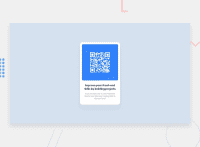
Design comparison
Solution retrospective
Hi, I'm new here and want to learn frontend. Please review my project and help me improve.
Community feedback
- @vanzasetiaPosted about 2 years ago
Hi, Rajesh Singh! 👋
Congratulations on completing your first Frontend Mentor challenge! 🎉 Well done on getting the HTML right! 👏
Here are some recommendations for improvements.
- You can make the
bodyelement as the flex container for mobile users as well. Also, never limit the height of thebodyelement. It will not allow the users to scroll the page if the page content needs moreheight. So, my recommendation is to usemin-heightinstead. - I recommend setting the
max-widthfor the card element on the initial styling instead of inside the media query.
If you follow those two suggestions, the site should be responsive without any media queries. 🙂
I hope this helps! Keep up the good work! 👍
1 - You can make the
- @DavidMorgadePosted about 2 years ago
Hello Rajesh, congrats on finishing the challenge and welcome to the frontendmentor community!
In my opinion you did a great job as a first solution here! using
max-widthis a great option to get your component responsive.Apart from that, I would move out the flex for your
<body>out of the media querie, since you want to get centered also for mobile devices, if you keep it in the media querie, it will only get centered for higher sizes!Hope my feedback helps you, if you have any questions, don't hesitate to ask!
1
Please log in to post a comment
Log in with GitHubJoin our Discord community
Join thousands of Frontend Mentor community members taking the challenges, sharing resources, helping each other, and chatting about all things front-end!
Join our Discord

