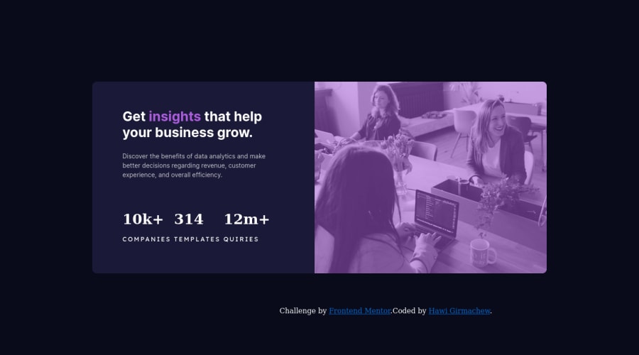
Design comparison
Solution retrospective
I used to build it using flexbox it was that much more challenging for me, but I was confused with images and how to set them inside the div.
Community feedback
- @correlucasPosted about 2 years ago
👾Hello Hawi Girmachew, Congratulations on completing this challenge!
Amazing solution! I’ve just opened the solution’s live site and I liked the job you’ve done a lot. I’ve some suggestions for you:
1.The way you’ve applied the purple color is fine, but if you want the exact color tone of color of the challenge designs, you need to use
mix-blend-modeto make the color blend between the image and the background-color of the container. See the steps below to apply to theimgorpictureselector:img { mix-blend-mode: multiply; opacity: 75%;}2.Use units as
remoreminstead ofpxto improve your performance by resizing fonts between different screens and devices. These units are better to make your website more accessible. REM does not just apply to font size, but to all sizes as well.✌️ I hope this helps you and happy coding!
0
Please log in to post a comment
Log in with GitHubJoin our Discord community
Join thousands of Frontend Mentor community members taking the challenges, sharing resources, helping each other, and chatting about all things front-end!
Join our Discord
