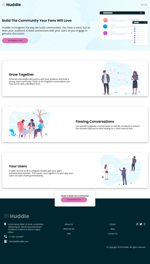
Responsive page using CSS Flex-Box and CSS Grid
Design comparison
Solution retrospective
It took much longer than I anticipated to do, but I made an effort to do it well. Please offer me your recommendation since it will help me.
Community feedback
- @VCaramesPosted about 2 years ago
Hey @Hawigirmachew, some suggestions to improve you code:
-
The Alt Tag description in the logo needs to be improved upon. The logo is arguably the most important image in you page. So the description should state the company name and what it is.
-
Your "buttons" were created with the incorrect element. When the user clicks on the button they should directed to a different part of you site. The Anchor Tag will achieve this.
-
Along with the blank alt tag, you also want to include the aria-hidden=“true” to your Illustrations* to fully remove it from assistive technology.
-
The styling needs further work, you want to get a close a possible as the FEM example
padding
needs some adjusting.- CTA section
width
needs to be increased. box-shadow
needs to be lighter.- etc...
Happy Coding! 👻🎃
0@HawigirmachewPosted about 2 years ago@vcarames Thanks. I will try to do it better.
0@HawigirmachewPosted about 2 years ago@Hawigirmachew can you see my code I think i resolve the issues i had before.
0@VCaramesPosted about 2 years ago@Hawigirmachew
The buttons HTML code was updated and the aria-hidden=“true” was added to the illustration.
The CTA sections still needs work and some of the styling in the mobile view still needs work also.
0@HawigirmachewPosted about 2 years ago@vcarames Thanks. I'll consider your advice for my upcoming project.
0 -
Please log in to post a comment
Log in with GitHubJoin our Discord community
Join thousands of Frontend Mentor community members taking the challenges, sharing resources, helping each other, and chatting about all things front-end!
Join our Discord