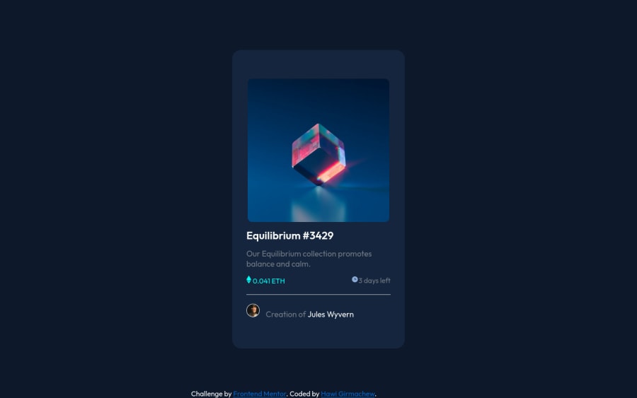
Design comparison
SolutionDesign
Solution retrospective
I didn't know why my card is out of the section when the width of device is below 150px can me how to solve it thanks.
Community feedback
- @AdrianoEscarabotePosted about 2 years ago
Hi Hawi Girmachew, how are you?
I really liked the result of your project, but I have some tips that I think you will like:
1- Page should contain a level-one heading, you could have changed
h2toh1click hereTo improve the hover effect, I made some changes to the code:
I added:
.backhover {
    height: 100%;
    width: 100%;
    background-color: #5d7fab3b;
}
.backhover { position: absolute; left: 50%; top: 50%; transform: translate(-50%, -50%); }If you have any questions, answer this comment and I'll explain better!!
The rest is great!!
Hope it helps...👍
0
Please log in to post a comment
Log in with GitHubJoin our Discord community
Join thousands of Frontend Mentor community members taking the challenges, sharing resources, helping each other, and chatting about all things front-end!
Join our Discord
