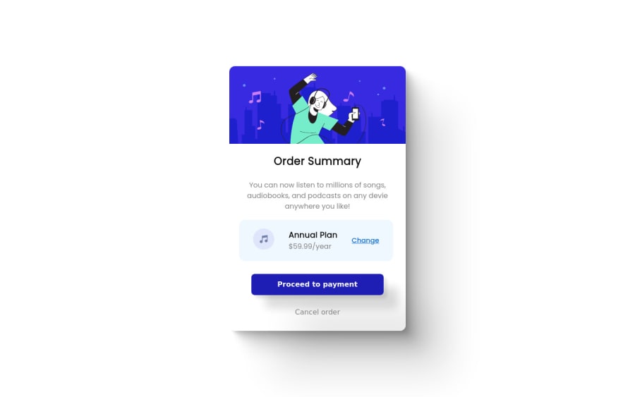
Design comparison
SolutionDesign
Community feedback
- @denieldenPosted over 2 years ago
Hi Umar, great work on this challenge! 😉
Here are a few tips for improve your code:
- for add the top image in the background just put more specific background properties to the body:
background: url("../img/pattern-background-desktop.svg") no-repeat top center; background-size: contain; background-color: #e0e8ff;- add
maintag and wrap the card for improve the Accessibility - add descriptive text in the
altattribute of the images - remove all unnecessary code, the less you write the better as well as being clearer: for example the
divcontainer of image - instead of using
pxuse relative units of measurement likerem-> read here
Overall you did well 😁 Hope this help!
Marked as helpful1@umar453Posted over 2 years ago@denielden Hi bro, Thanks for your valuable suggestion on my challenge. The points you made are absolutely right and valid and I will keep in mind for my future projects and challenges.
Again Thanks for your valuable advice. cheers1
Please log in to post a comment
Log in with GitHubJoin our Discord community
Join thousands of Frontend Mentor community members taking the challenges, sharing resources, helping each other, and chatting about all things front-end!
Join our Discord
