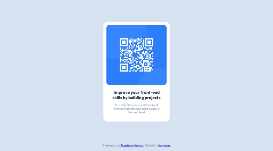
Design comparison
Solution retrospective
Next time I would try to do it without flex.
What challenges did you encounter, and how did you overcome them?I had some problems with vertically centering my QR code box. I could solve this problem with flex.
What specific areas of your project would you like help with?I would like to know other methods of centering my QR code box.
Community feedback
- P@tdimnetPosted about 1 year ago
<link rel="stylesheet" href="style.css">
<link rel="preconnect" href="https://fonts.googleapis.com">
<link rel="preconnect" href="https://fonts.gstatic.com" crossorigin>
<link href="https://fonts.googleapis.com/css2?family=Outfit:wght@100..900&display=swap" rel="stylesheet">
The
style.csscould be add at the bottom instead to be at the top. It tends to be a good practice to do it.Nice work to have used css variables :).
0 - P@Artiom-DeyevPosted about 1 year ago
Very good use of variables for css. Just as in my soultion, I see the box-shadow is not applied (I understand this is because the specifics for it are not probided in the design). Very good.
0
Please log in to post a comment
Log in with GitHubJoin our Discord community
Join thousands of Frontend Mentor community members taking the challenges, sharing resources, helping each other, and chatting about all things front-end!
Join our Discord
