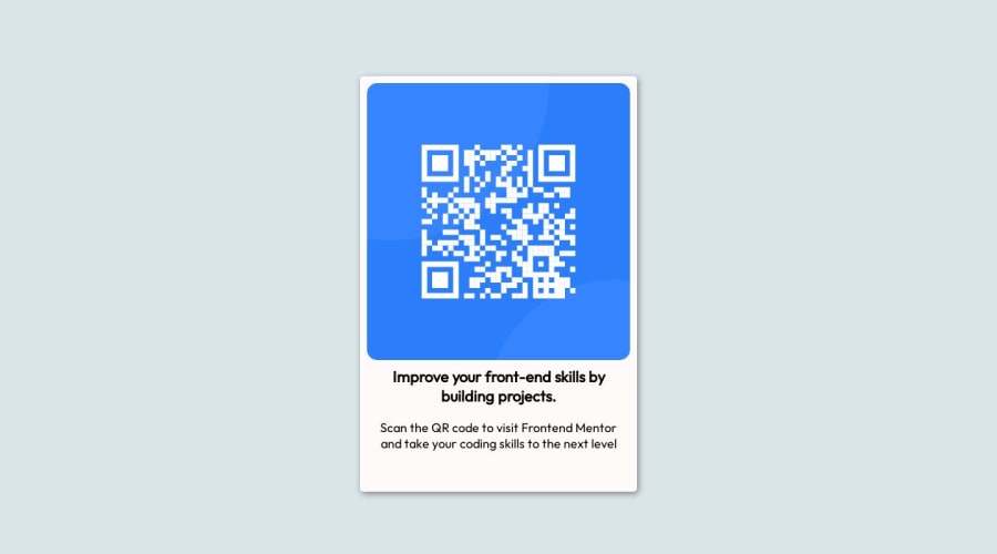
Design comparison
Solution retrospective
Feedbacks are welcomed, Help me to improve
Community feedback
- @danielmrz-devPosted 11 months ago
Hello @kshr-kumar!
Your solution looks pretty good!
I have a few suggestions:
-
Use tag
imgfor the img instead of an empty div andbackground-image. -
For semantic reasons, and since that is the main title of the screen, you can replace the
<p>with<h1>.
The
<h1>to<h6>tags are used to define HTML headings.<h1>defines the most important heading.<h6>defines the least important heading. Only use one<h1>per page - this should represent the main heading/subject for the whole page. Also, do not skip heading levels - start with<h1>, then use<h2>, and so on.- Also, still about semantic HTML, you can replace your
div.flex-containerwithmain.flex-container.
All these changes may have little or no visual impact but they make your HTML code more semantic and improve SEO optimization as well as the accessibility of your project.
I hope it helps!
Other than that, great job!
Marked as helpful0 -
- @MelvinAguilarPosted 11 months ago
Hello there 👋. Good job on completing the challenge !
I have some suggestions about your code that might interest you.
- You can remove the comments; they take up a lot of space, and GitHub keeps track of your changes.
- Wrap the entire main content in the
<main>tag.
- For the QR code image, avoid using the background-image property; instead, use the
<img>tag for informative images.
- Opt for relative units (
emorrem) instead of pixels for font-size. Resource 📘.
- Prefer
min-height: 100vhoverheightto prevent cutoff on smaller screens, like mobile phones in landscape orientation.
I hope you find it useful! 😄 Above all, the solution you submitted is great!
Happy coding!
0
Please log in to post a comment
Log in with GitHubJoin our Discord community
Join thousands of Frontend Mentor community members taking the challenges, sharing resources, helping each other, and chatting about all things front-end!
Join our Discord
