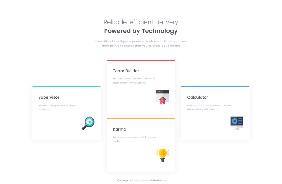
Design comparison
Solution retrospective
I had a lot of trouble deciding breakpoints for devices and found creating a tablet version really difficult... I'd appreciate help on this!
Community feedback
- @grace-snowPosted about 3 years ago
Hi
I would advise redoing this challenge to be honest. First do some of the simpler challenges to nail the foundations of html and flexbox, then return to this when you are ready to practice CSS Grid. That is what this challenge is designed for.
When you refactor it (and with any projects in future)…
First focus only on html. Use proper semantic elements. Imagine it is a normal document with no styles - think “what elements should be used?”
Then add the structural elements to the html to achieve the layout (probably one main element or div with 4 divs inside)
Now start to think about styling. CSS reset goes first, then your base styles that will be appropriate for all screen sizes. Let the base styles be all that you need for mobile. Open dev tools on the side and shrink your viewport down so it’s narrow like a mobile phone, that can help.
The cards on this don’t need a width or height setting if you use css grid. The grid can handle all the sizing and positioning. If you use css grid right from the start for this your grid will have one column with a minmax() size and 4 rows with an auto size.
Next start to enlarge the viewport. When it looks large enough for the layout to change, that’s when you add a min-width breakpoint. All that needs to change in that media query is the grid template and grid children positions (learn about grid template areas, that’s much easier to understand than placing elements on grid lines IMO).
Good luck
1@akcumehPosted about 3 years ago@grace-snow okay thank you 😊 This is one of the simplest challenges on the site though… and what do you mean “what elements should be used?” Is it not alright to use divisions?
In the report I also saw complaints about same ids being used for multiple divs. What’s wrong with that? Isn’t it smart work to customize one label and use that style on multiple items which would end up having the same style anyway?
0@grace-snowPosted about 3 years ago@akcumeh I wouldn’t call this one of the simplest. There are definitely smaller and simpler ones than this.
You can learn a lot from the other challenges, working mobile first and reading up as you go. It’s better to take a long time doing the tiny challenges to get the code quality high and build those foundations up. You’ll see the benefit.
It’s essential before anything else to learn semantic html. Semantics means using meaningful elements like paragraphs, headings, lists, anchor tags, buttons etc (there are hundreds of them but you don’t need to know all of them). Divs and spans are not meaningful elements. They are used when extra is needed just for layout structure, divs for block and spans for inline.
IDs are not meant to be used for styling. They need to be unique. Their purpose is for anchoring to elements not styling or JavaScript. For styling, use classes as they can be reused on multiple elements.
I hope that helps
Marked as helpful1 - @seekinfoxPosted about 3 years ago
I think you should try and use simple flexbox and grid.
Using too much of positioning will make your code hard to maintain And it's a headache if your project is more complex and big. You can check out my code for this challenge, I have used flexbox.
1
Please log in to post a comment
Log in with GitHubJoin our Discord community
Join thousands of Frontend Mentor community members taking the challenges, sharing resources, helping each other, and chatting about all things front-end!
Join our Discord