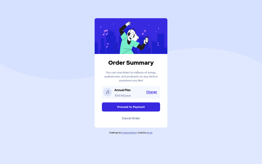
Design comparison
Solution retrospective
Suggestions to improve are most welcome.
Community feedback
- @DrougnovPosted over 3 years ago
Hello @ayushv45, Great job. It's looking good.
However, here are something you can do to make it even better:
-
The pattern doesn't look good in 375px or lower width devices. Use a different background image for mobile devices using media queries. It is provided in the images folder.
-
Use the blue-ish color on the headings as the design requires.
-
Try to avoid
divwhenever you can. Usemaindirectly on the container class and thefooteron the attribution class. It's better for accessibility.
Good luck with the next solution and Happy coding :)
Marked as helpful1 -
Please log in to post a comment
Log in with GitHubJoin our Discord community
Join thousands of Frontend Mentor community members taking the challenges, sharing resources, helping each other, and chatting about all things front-end!
Join our Discord
