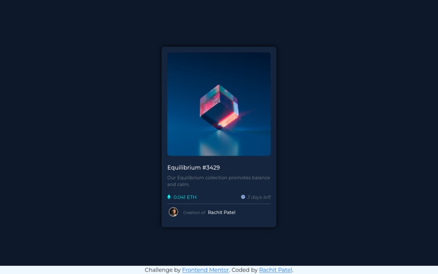
Responsive page using bootstrap, layout using bootstrap flex
Design comparison
Community feedback
- @correlucasPosted about 2 years ago
👾Hello @rachit0706, Congratulations on completing this challenge!
Great solution and a great start! From what I saw you’re on the right track. I’ve few suggestions for you that you can consider adding to your code:
1.Add transitions to make the interaction smoother while the element gets hovered, you can use a value like
transition: all ease-in 0.5s.2.Use
<main>instead of<div>to wrap the card container. This way you show that this is the main block of content and also replace the div with a semantic tag.3.The value you’ve used for the shadow make it too much dark and strong. To improve your box-shadow, you’ve to have in mind two things that make a good shadow,
blurandlow opacityfor smooth shadows. To improve your current shadow, decrease theopacityand increase theblur, try this value instead:box-shadow: 12px 7px 20px 6px rgb(57 75 84 / 8%);If you’re not familiar to box-shadow you can use this site to create the shadow design and then just drop the code into the CSS: https://html-css-js.com/css/generator/box-shadow/
✌️ I hope this helps you and happy coding!
Marked as helpful1
Please log in to post a comment
Log in with GitHubJoin our Discord community
Join thousands of Frontend Mentor community members taking the challenges, sharing resources, helping each other, and chatting about all things front-end!
Join our Discord
