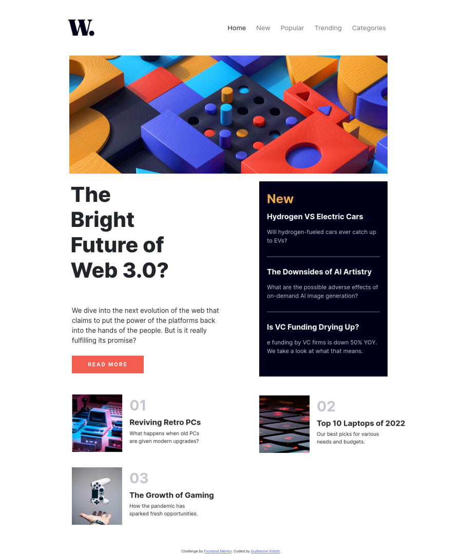
Responsive page using bootstrap (failed on using BS)
Design comparison
Solution retrospective
I don't really know why i had hard moments to do this SIMPLE page, i tryied first to use bootstrap, i never used, so, i tryed to learn doing the challenge, and i couldn't complete with the Bootstrap, so i used more pure HTML/CSS than the BS itself. The code is very messy, in the middle of the challenge i thought about give up, or doing it from beginning, but i finished it like that, and i'm going to search another challenge that looks like that and improve. At least i tryed! Sorry for the messy code :(.
Community feedback
- @allreddvPosted about 2 years ago
Hi Guilherme, I am a newbie so take the advise with a grain of salt, but I noticed that your layout is considerably different than the design. One thing I have realized as I am working through these challenges is that most of them have some tricky things that are hard to notice until you try to match up the designs really close. I think these tricky details are put into the challenge to help teach new things. For example when I worked on this one it was a bit of struggle for me to get everything to line up perfectly using grid. At the end of the challenge I felt a lot more confident in using grid layouts because I forced myself to get it to match the design. In the end I usually end up learning a lot from really trying to get the solution as close to the original design as possible. Anyways, everything looks good otherwise.
Marked as helpful0@VidottizzzPosted about 2 years ago@allreddv Hey man, thank you for the feedback! I really tried to use grid, but i tried to use it on bootstrap, and i found hard to understand, next challenge, i'm going to use grid without the BS, just pure HTML, CSS, i think it'll make me understand more than just jump to the BS.
0@allreddvPosted about 2 years ago@Vidottizzz Yeah I am doing everything for now with vanilla HTML, CSS, JS. Once I feel really confident with this I will look to using React, Bootstrap, Tailwind etc. I just got a review from one of the senior mentors on the site on this same project. Even though my solution is basically pixel perfect from the screenshot, I received a huge list of things that need to be fixed. It is a learning process, but that is why we are on this site.
Marked as helpful0
Please log in to post a comment
Log in with GitHubJoin our Discord community
Join thousands of Frontend Mentor community members taking the challenges, sharing resources, helping each other, and chatting about all things front-end!
Join our Discord
