Submitted about 1 year agoA solution to the Recipe page challenge
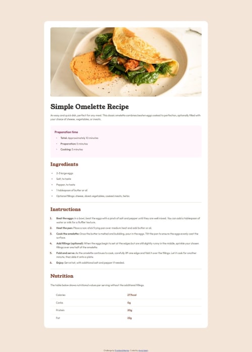
Responsive Page of Simple Omelette Recipe
@nayan041

Solution retrospective
What are you most proud of, and what would you do differently next time?
- The pseudo element
::markeris new to me. For styling bullet points' or serial numbers' color, I get familiar with this element. - The way of increasing gap between list-text and bullet point or serial numbers. The
padding-leftproperty forul/oland forlidoes not do the same thing. - The usage procedure of media queries and table borders.
- The horizontal ruling style.
- Margin and Padding related settings. When Padding is applied to the parent element, content takes 100% width of parent element available after padding space is locked. But if padding is applied to the child element,
border-radiusproperty does not work for child. Again, if margin is applied for child element, it will overflow the parent container. - Selecting
tableelement related elements using:first-child/ :last-childuse-cases.
- The problem I encountered most is aligning smaller sized (than text itself) bullet points with list-text as vertically to centre.
- I want to learn how to align smaller sized (than text itself) bullet points with list-text as vertically to centre.
Code
Loading...
Please log in to post a comment
Log in with GitHubCommunity feedback
No feedback yet. Be the first to give feedback on Aynul Islam's solution.
Join our Discord community
Join thousands of Frontend Mentor community members taking the challenges, sharing resources, helping each other, and chatting about all things front-end!
Join our Discord