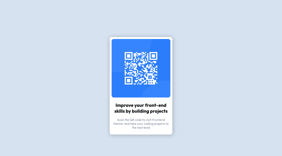
Design comparison
Solution retrospective
How's my website design? How is the code for making this website? Is it complex or easy?
Community feedback
- @correlucasPosted about 2 years ago
πΎHi @Simply-huMAN, congratulations on your solution!π Welcome to the Frontend Mentor Coding Community!
Great solution and a great start! From what I saw youβre on the right track. Iβve few suggestions for you that you can consider adding to your code:
- Use
<main>
instead of a simple<div>
this way you improve the semantics and accessibility showing which is the main block of content on this page. Remember that every page should have a<main>
block and that<div>
doesn't have any semantic meaning. - Replace the
<h2>
containing the main title with<h1>
note that this title is the main heading for this page and every page needs one h1 to show which is the most important heading. Use the sequence h1 h2 h3 h4 h5 to show the hierarchy of your titles in the level of importance, never jump a level. - Add a margin of around
margin: 20px
to avoid the card touching the screen edges while it scales down. - Use relative units as
rem
orem
instead ofpx
to improve your performance by resizing fonts between different screens and devices. These units are better to make your website more accessible. REM does not just apply to font size, but to all sizes as well.
Here's my solution for this challenge if you wants to see how I build it: https://www.frontendmentor.io/solutions/qr-code-component-vanilla-cs-js-darklight-mode-nS2aOYYsJR
βοΈ I hope this helps you and happy coding!
Marked as helpful0 - Use
- @AatypicPosted about 2 years ago
Hello and congratulations on your first solution !
You can achieve the same results with less
<div>
s. Not everything needs to be contained in a <div>, I've been there :DFor this project you can actually do it without any <div>. In your html you could do :
<body> <main class="card"> //the container <img> <h1>... <p>... </main> </body>
Good luck βοΈ
Marked as helpful0 - @kostyafarberPosted about 2 years ago
Hey there! π
Really good solution, I like the way your code is laid out!
Just a couple of suggestions:
- Try to use relative units such as
rem
orem
. They are more versatile and are more responsive thanpx
units. - Try use a css reset! It will make your life easier and remove any pesky default settings. (e.g here)
- Perhaps add some whitespace between your css declarations. It will make it easier to read.
body { font-family: Outfit; margin: 0; padding: 0; box-sizing: border-box; background: hsl(212, 45%, 89%); } main { margin: 30px; display: flex; justify-items: center; align-items: center; }
- Delete any comments! This will make your code look a lot cleaner whilst also making it easier to read.
Great work on this! π
Happy coding.
If you found this helpful, please mark it as helpful π
Marked as helpful0 - Try to use relative units such as
Please log in to post a comment
Log in with GitHubJoin our Discord community
Join thousands of Frontend Mentor community members taking the challenges, sharing resources, helping each other, and chatting about all things front-end!
Join our Discord