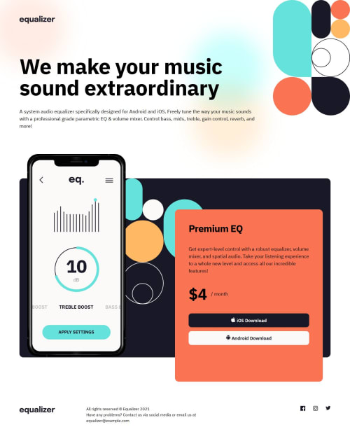
Responsive page for Equalizer, using CSS Grid, Custom Properties, SCSS

Solution retrospective
I was able to do this challenge relatively quickly. I am getting more confident with setting up my projects and the basic workflow.
What challenges did you encounter, and how did you overcome them?Most challenging was positioning the image and card element. I ended up using CSS Grid which was able to sort most of the difficulties I had.
What specific areas of your project would you like help with?I would appreciate any feedback on my work. I know my code is still messy and could be cleaner. Also my file structure on source code might be a bit overkill for such small projects, but I want to be comfortable with this as i progress and it should be handy in the future.
Please log in to post a comment
Log in with GitHubCommunity feedback
No feedback yet. Be the first to give feedback on Lukáš T.'s solution.
Join our Discord community
Join thousands of Frontend Mentor community members taking the challenges, sharing resources, helping each other, and chatting about all things front-end!
Join our Discord