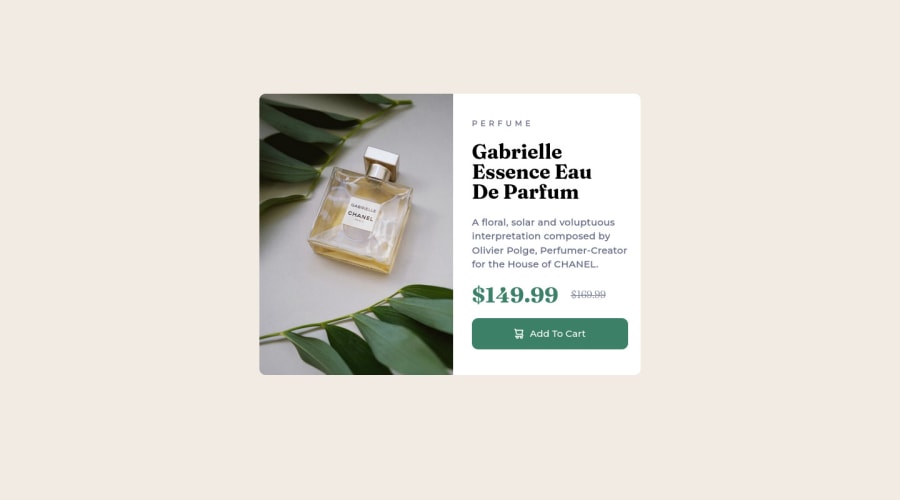
Design comparison
Community feedback
- @VCaramesPosted over 2 years ago
Hey there! 👋 Here are some suggestions to help improve your code:
- To properly center your content to your page, you will want to add the following to your
Bodyelement (this method uses CSS Grid):
body { min-height: 100vh; display: grid; place-content: center; }- Since the images in this component add value and serve a purpose (displaying the product), it is best to use the
Pictureelement and not thebackground-imageproperty, as it will to use different images during different breakpoints.
Here is an example of how it works: EXAMPLE
Syntax:
  <picture>
    <source media="(min-width: )" srcset="">
    <img src="" alt="">
  </picture>
More Info:
https://www.w3schools.com/html/html_images_picture.asp
https://web.dev/learn/design/picture-element/
-
Remove all the
<br>you added; they are unnecessary. -
Currently, the old price (169.99) 🏷 is not being properly announced to screen readers. To fix this, you are going to wrap the the price in a
DelElement and inside it you will add aSpanElement with an sr-only class that will state something like “The previous price was…” and use CSS to make it only visible to screen readers.
If you have any questions or need further clarification, feel free to reach out to me.
Happy Coding! 🍂🦃
1 - To properly center your content to your page, you will want to add the following to your
Please log in to post a comment
Log in with GitHubJoin our Discord community
Join thousands of Frontend Mentor community members taking the challenges, sharing resources, helping each other, and chatting about all things front-end!
Join our Discord
