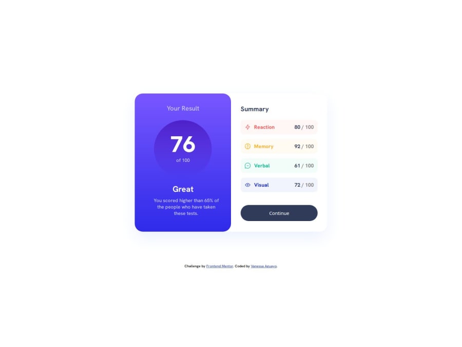
Responsive page about cognitive results using html, css, json and js


Design comparison

Community feedback
- P@nishanth1596Posted 3 months ago
Great implementation. Using rem units offers greater flexibility, scalability, and accessibility, making the design more adaptable, user-friendly, and maintainable. For these reasons, it's often better to use rem instead of px.
A helpful trick I use is setting the font size of the root element (<html>) to 62.5%, like this:
html {
  font-size: 62.5%; /* 1rem = 10px */
}
This way, you can work with rem units in a way that's similar to px. For instance, instead of writing 32px, you can simply use 3.2rem, making it easier to manage and maintain.
Hope this helps!
Edit: ignore this, I just now learned that we should not use this method of converting 1rem=10px but its highly advised to use rem instead of px
0

Please log in to post a comment
Log in with GitHub
Join our Discord community
Join thousands of Frontend Mentor community members taking the challenges, sharing resources, helping each other, and chatting about all things front-end!
Join our Discord