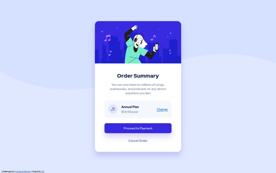


Design comparison

Solution retrospective
My main goal for this challenge was to use Flexbox but I feel I didn't make good use of it. So if you find someplace where I could use Flexbox instead of what I am using right now, I'd be happy to hear that! Otherwise, I'd appreciate your feedback/advice :)
Community feedback
- @ericsalviPosted almost 3 years ago
Hey Yui,
Great job with your first submission!
I think your flex works great for the pricing section where you have it now. I don't think there really is a need for anything else to have flex unless on mobile it needed to go from column to row. But for this component that is not the case.
A suggestion for future flex usage, instead of adding a
padding-left: 20pxto the item-2 class, you could just usegap: 20pxset on the flex container.I'd also try to name your classes according to what the content is. Reading the code, item-1 and item-2 don't really help the developer to fully understand what each section is. I like to implement the BEM naming convention, not required, just helpful.
One last thing is that the 2 buttons you have are not selectable via the keyboard. It looks like you just have 2 divs styled to appear like buttons. I'd check out https://a11y-101.com/design/button-vs-link for future submissions on buttons.
Also to piggyback on what Philemon was saying, each submission on this platform generates a report for any invalid accessibility or HTML. Check out your report It is good practice to try and fix them. I use the
axe DevToolsextension in Chrome before I submit.Can't wait to see more of your work!
Marked as helpful0@yteraiPosted almost 3 years ago@ericsalvi Thank you so much for your feedback! I'll def have those things in mind next time :)
0 - @correlucasPosted over 2 years ago
👾Hello Yui, congratulations for your solution!
I saw your old solution and I've some suggestion to you for improve it:
To make the card fully responsive and keep it contracting when the screen scales you need to fix the container
widthand also the image, to start you need to replacewidth: 450px;withmax-width: 450px;you'll see how changes after you do that, the card starts to resize.content { margin: 0px auto; text-align: center; background-color: #fff; max-width: 450px; height: 680px; position: absolute; top: 50%; left: 50%; transform: translate(-50%, -50%); border-radius: 20px; box-shadow: rgb(56 41 224 / 20%) 0px 20px 30px; }To make your image fully responsive add
display: blockandmax-width: 100%andobject-fit: coverto make the image auto-crop when resizing inside the column:img { object-fit: cover; display: block; border-radius: 20px 20px 0 0; max-width: 100%; } .content-image { object-fit: cover; display: block; border-radius: 20px 20px 0 0; max-width: 100%; }👋 I hope this helps you and happy coding!
0 - @maiaflowPosted almost 3 years ago
I like how you styled your attribution credit on the bottom left. Mine was confusing my vertical alignment so I just commented it out LOL. also, I like how you organized your CSS with commented out headings. I'm gonna try that next time! Looking forward to seeing your next submission!
0@yteraiPosted almost 3 years ago@maiaflow Thanks for your feedback, Maia! Looking forward to seeing your next submission too :)
0 - @bahati7Posted almost 3 years ago
Hello Yui,
congratulations for this challenge:) just few tips to improve the code:
- add "alt" attributes on img tags for accessibilty;
- wrap your code in a "main" tag instead of div class="content">
- use relative units like %, rem to specify the width of the ".content" class, after that you can add "max-width: 450px";
- you are not obliged to specify the height of the ".content" class
once again good job!!!
0


Please log in to post a comment
Log in with GitHub
Join our Discord community
Join thousands of Frontend Mentor community members taking the challenges, sharing resources, helping each other, and chatting about all things front-end!
Join our Discord