Not Found
Not Found
Not Found
Not Found
Not Found
Not Found
Not Found
Not Found
Not Found
Not Found
Not Found
Not Found
Not Found
Not Found
Not Found
Not Found
Not Found
Not Found
Not Found
Not Found

Submitted

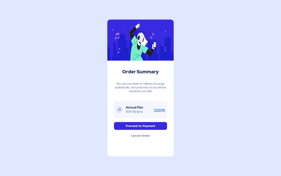
Responsive order summary with classic HTML and CSS

Rohit Deshpandeβ€’ 870

@rohitd99

Desktop design screenshot for the Order summary component coding challenge

This is a solution for...

  • HTML
  • CSS
1newbie
View challenge

Design comparison


SolutionDesign

Solution retrospective


All suggestions are welcome ! Thanks.

Community feedback

P
Jake Godsallβ€’ 1,390

@jakegodsall

Posted

Hi 😊

Great work on this component.

Layout wise, the major think I can see here is that you could have done with a little more padding on the left and right of your text-component element. The musical note and the change link seem to be a little close to the edge.

I really like how responsive this design is, especially how the height of the component shrinks with decreasing viewport, but there is a point where the shrunk component snaps back to full size at 540px viewport height. The components snaps from around 450px in height to approximately 530px. Not a huge issue, I really had to search to find something to criticise here! πŸ˜„

Hope this helps

Marked as helpful

0

Rohit Deshpandeβ€’ 870

@rohitd99

Posted

@jakegodsall Thank you for your suggestions, actually I knowingly kept it so because while making it responsive I viewed it on the Iphone 4 from developer tools and the height was too small for the components so I did the height to auto. But I can fix it by adding a margin:20px; to the article. But I do not know how to make the transition smooth and not make it snap back.

0
Lucas πŸ‘Ύβ€’ 104,420

@correlucas

Posted

πŸ‘ΎHello Rohit Deshpande, congratulations for your new solution!

Your solution is great, also the design is perfect.

There are two issues in this solution, one is the property overflow: hidden that is cropping the text when the container scales and the header image that is losing the proportion when scaling. Here's my tips:

Make your image responsive using display: block and max-width: 100% and scale with the container

.img-part img {
    width: 100%;
    height: 100%;
}

πŸ‘‹ I hope this helps you and happy coding!

Marked as helpful

0

Rohit Deshpandeβ€’ 870

@rohitd99

Posted

@correlucas I kept the overflow: hidden so that I can directly round the corners by applying border-radius on the article itself, otherwise I'd have to keep border-radius on the image too. I'll surely try and make the image responsive with your suggestions, Thank you.

0

Please log in to post a comment

Log in with GitHub
Discord logo

Join our Discord community

Join thousands of Frontend Mentor community members taking the challenges, sharing resources, helping each other, and chatting about all things front-end!

Join our Discord