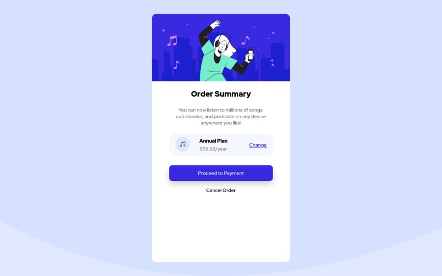
Responsive Order Summary using Sass
Design comparison
Solution retrospective
I have question in placing margin. I got confuse whether to place margin-top in below block, margin-bottom in upper block or add utility class that handle margin independently.
Community feedback
- @AdrianoEscarabotePosted over 2 years ago
Hi Odiesta, how are you?
I really liked the result of your project, but I have some tips that I think you will enjoy:
To improve the page design, we can do this:
.container {
    /* height: 90vh; */
}
it is not necessary to use a fixed height in the component!
To prevent the background image from breaking at higher resolutions, we can prevent this in two different ways:
-
Add a
background-repeat: repeat-x;, the image will repeat on the horizontal axis, preventing it from breaking. -
Add a
background-size: 100% 50vmin;, the50vminwill set its height as the page target, and100%will make it stretch on the horizontal axis.
Feel free to choose one of the two!
The rest is great!**
I hope it helps... 👍
Marked as helpful1 -
Please log in to post a comment
Log in with GitHubJoin our Discord community
Join thousands of Frontend Mentor community members taking the challenges, sharing resources, helping each other, and chatting about all things front-end!
Join our Discord
