Design comparison
SolutionDesign
Solution retrospective
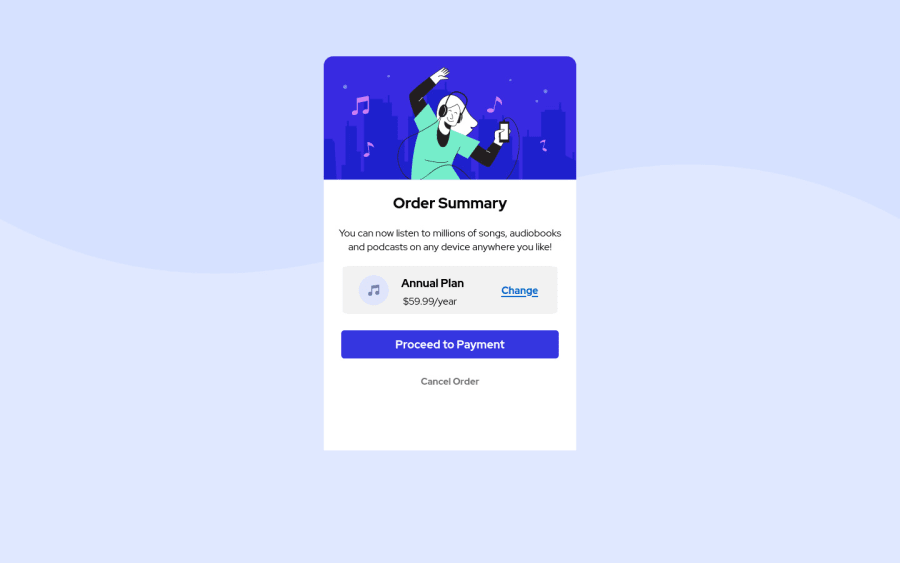
Made this responsive order summary static page using HTML and CSS. This is one of my first projects. If you have any other advice, please feel free to tell me! Thank you for watching! :D
Community feedback
- @darryncodesPosted almost 3 years ago
Hi Saksham,
Great effort, a really close match to the design - well done!
- I think
background-size: 100% auto;would be preferable on the<body>, the first value is for the width and the second is for the height - At the moment the border-radius is not showing on the bottom of the card. With your set up you'll need to add
border-bottom-left-radius: 15px;border-bottom-right-radius: 15px;to.order-footer - I'd encourage you to clear down your accessibility/html report by adding alt-text to your images, include a
<h1>in your design and swap<div class="order">with<main class="order">
I hope that helps!
Marked as helpful0 - I think
- @rsrclabPosted almost 3 years ago
Hi, @sakshamian ~
Congratulate on your solution to the challenge on FM platform. I have studied your work carefully and learned a lot from it.
Here are some of the tips I like to provide.
- I hope you to add transition effects on touchable elements like button and links.
- Now Cancel Order is just a string, but it must become button also.
- Plan information alignment isn't the same with design. I think
justify-content: space-between;would be better in this case. - For body
background-size: 100%must be provided.
If it can help you even a bit, it would be happy to me.
Cheers ~
Marked as helpful0
Please log in to post a comment
Log in with GitHubJoin our Discord community
Join thousands of Frontend Mentor community members taking the challenges, sharing resources, helping each other, and chatting about all things front-end!
Join our Discord
