Design comparison
SolutionDesign
Community feedback
- @emadbakryPosted over 2 years ago
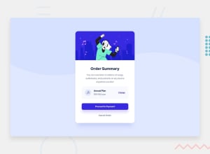
very good work, Andrew. i would like to say that it would be better if you focus on dimensions like the width and dont forget to use padding for the content to be exactly like the origin design.
Another thing is the "box shadow" dont you notice a shadow under the blue button? use box-shadow to make the same shadow so it could look more realistic.
1@NwosePosted over 2 years ago@emadbakry thanks emad for the observation, i will work on it.
0@emadbakryPosted over 2 years ago@Nwose welcome, and dont forget pleasely to make feedback on mine.
0
Please log in to post a comment
Log in with GitHubJoin our Discord community
Join thousands of Frontend Mentor community members taking the challenges, sharing resources, helping each other, and chatting about all things front-end!
Join our Discord
