

Design comparison

Solution retrospective
i am confident that i did justice regarding this project. please review it and let me know of what i shoud do differently next time.
What challenges did you encounter, and how did you overcome them?the plan section was a bit of a challenge but its a thing of the past now.
What specific areas of your project would you like help with?Please review my code and let me know. because without a mentors guidance I would fool myself into thinking I did it PERFECTLY, so please help me improve. I am eager to learn. Thanks
Community feedback
- @BrianMunizSilveiraPosted 5 months ago
Code Review and Suggestions
Positive Highlights:
- Consistent Design System: The use of CSS variables (
:root) centralizes theme colors and makes maintenance easier. - Semantic HTML: The structure is logical and aids readability with appropriate use of tags like
<div>and<a>. - Responsiveness: Grid layout with
place-items: centerensures a visually centered design on all screen sizes. - Clean CSS: Organized selectors and well-separated styles enhance readability.
Suggested Improvements:
1. Accessibility Enhancements
- Alt Text: Provide descriptive
altattributes for images to ensure screen reader compatibility.
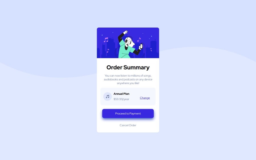
<img class="hero" src="illustration-hero.svg" alt="Illustration of a music service banner"> <img class="icon" src="icon-music.svg" alt="Music note icon">- Button Semantics: Use
<button>elements for interactive actions like "Proceed to Payment" instead of<a>to improve semantics and usability.
<button class="payment">Proceed to Payment</button>
<button class="cancel">Cancel Order</button>
2. Responsive Design
- Address the typo in the media query for screen widths less than
40px(likely meant for mobile). Update it to target realistic device sizes:
@media screen and (max-width: 480px) {
    body {
        background-image: url(pattern-background-mobile.svg);
    }
    .container {
        width: 90%;
    }
    h1 {
        font-size: 1.5em;
    }
}
3. CSS Improvements
Overly Specific Selectors: Simplify and avoid redundancy. For example:
a.payment:hover {
    background-color: var(--plan-payment-Hover-Color);
}
Instead, use a shared
hoverstyle for buttons:.btn { text-decoration: none; display: block; border-radius: 10px; text-align: center; } .btn:hover { background-color: var(--plan-payment-Hover-Color); }
4. Performance Optimization
- Preload Critical Assets: Use
rel="preload"for critical fonts to improve loading speed.
<link rel="preload" href="https://fonts.googleapis.com/css2?family=Red+Hat+Display:wght@500;700;900&display=swap" as="style">- Reduce Font Overhead: Include only required font weights and styles instead of multiple families.
5. Content Alignment
- Ensure spacing consistency by using padding instead of
margin-leftandmargin-rightin.txt-body:
.txt-body {
    padding: 0 20px;
    margin-top: 30px;
}
Summary
Your solution is well-structured and adheres to modern CSS practices. By addressing these suggestions, you’ll enhance accessibility, responsiveness, and maintainability, making your project even more polished. Keep up the great work!
Marked as helpful0@mamman-nafPosted 5 months ago@BrianMunizSilveira Thank you so much for taking your time to review my project. Will make sure go work on the corrections you made and implement them in my future projects. Please feel free to correct me any time. I’m eager go learn
1@BrianMunizSilveiraPosted 5 months ago@mamman-naf Thank you for sharing your project!
I'm happy to help with the corrections and suggestions. Keep practicing and applying what you've learned, and you'll definitely see great improvement in your future projects.
If you ever need more tips or feedback, feel free to reach out. Good luck and keep up the great work!
0 - Consistent Design System: The use of CSS variables (

Please log in to post a comment
Log in with GitHubJoin our Discord community
Join thousands of Frontend Mentor community members taking the challenges, sharing resources, helping each other, and chatting about all things front-end!
Join our Discord