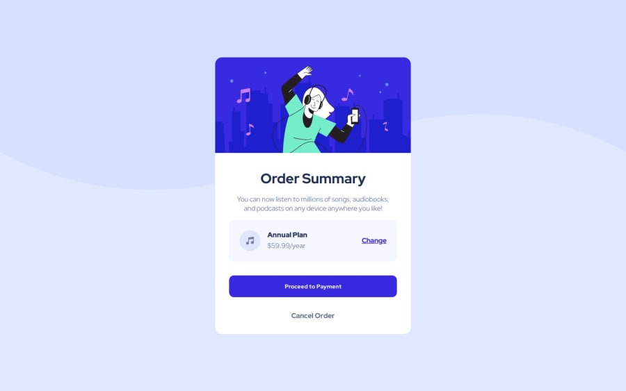
Design comparison
SolutionDesign
Solution retrospective
What are you most proud of, and what would you do differently next time?
Using media queries for responsiveness
What specific areas of your project would you like help with?How to improve the code ? Is it clear enough ? ect... I'm open to every little comments ;)
Community feedback
- P@kodan96Posted 10 months ago
hi there! 👋
A couple of tips:
HTML:
- all content within the
bodyshould be contained within landmarks. these are the header, main and footer HTML tags. for a project like this use at least a<main>tag
CSS:
- don't apply
widthorheightto your elements, they will adapt to their content by default. applying hard-coded dimensions to elements kills the responsivity of your website. If you really want to control these dimensions applymax-widthormin-widthto them. you can combine these with thewidthproperty as well:
.element-selector {
  width: 90%;
  min-width: 30rem;
  max-width: 66ch;
}
in this case
.element-selectorwill take up 90% of the container's width, but won't expand above 66ch or shrink below 30remHope this was helpful 🙏
Good luck and happy coding! ✌
Marked as helpful1 - all content within the
Please log in to post a comment
Log in with GitHubJoin our Discord community
Join thousands of Frontend Mentor community members taking the challenges, sharing resources, helping each other, and chatting about all things front-end!
Join our Discord
