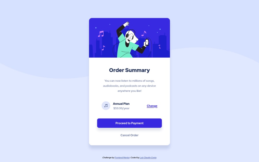
Responsive order summary just html and css
Design comparison
Solution retrospective
I would like to know if the html semantics are correct and if the css could be cleaner
Community feedback
- @pikapikamartPosted over 3 years ago
Hey, great work on this one. Just going to say that this is a nice solution on this one ^^. It also looks good in general.
Just some little suggestions on the site would be:
- Using
marginto center the layout is not consistent enough. Instead what you can do is that on thebodytag add these:
align-items: center; background-size: 100% # so that even if you zoom out, it will stay the same display: flex; flex-direction: column; justify-content: center; min-height: 100vh;- The price could just use a
ptag since using heading tag on it doesn't really give much information, heading on theannual-planis enough to describe the section.
Aside from those, great work again on this one.
Marked as helpful1@luizclaudiocostaPosted over 3 years ago@pikamart Thank you very much. I had never thought of using 100% body width. Very smart. Sometimes I'm afraid of writing too much css and there's a much simpler solution. Like the "margin:auto" one. I didn't know it wasn't consistent. Thank you very much for your tips and your feedback.
1 - Using
Please log in to post a comment
Log in with GitHubJoin our Discord community
Join thousands of Frontend Mentor community members taking the challenges, sharing resources, helping each other, and chatting about all things front-end!
Join our Discord
