Submitted about 2 years ago
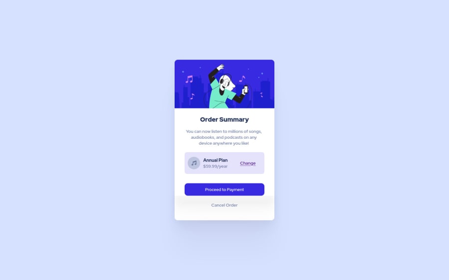
responsive order summary design using Html, Css

@Mouradis

Design comparison
SolutionDesign

Solution retrospective
any advise for a better code ?
Community feedback
Please log in to post a comment
Log in with GitHub
Join our Discord community
Join thousands of Frontend Mentor community members taking the challenges, sharing resources, helping each other, and chatting about all things front-end!
Join our Discord