Submitted over 1 year agoA solution to the Order summary component challenge
Responsive Order summary component with zero Layout Shift
styled-components, vite, react

@alkersan
Solution retrospective
What challenges did you encounter, and how did you overcome them?
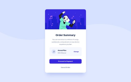
In this exercise, I wanted to avoid using the fixed-sized Hero image and prevent the containing block from grow uncontrollably.
const Wrapper = styled.div`
  width: fit-content;
  max-width: 327px;
  ...
  @media ${QUERIES.tabletAndUp} {
    max-width: 450px;
  }
`;
const Hero = styled.img`
  width: 100%;
  aspect-ratio: 45 / 22;
  object-fit: contain;
`;
The card can still shrink on small viewports (375px and less), and the image will not distort.
As a result, the Hero section can reserve enough space until the entire image is loaded, which prevents the Layout Shift (CLS)
What specific areas of your project would you like help with?Find a practical and lean approach for efficient resource preloading
Code
Loading...
Please log in to post a comment
Log in with GitHubCommunity feedback
No feedback yet. Be the first to give feedback on Dmytro's solution.
Join our Discord community
Join thousands of Frontend Mentor community members taking the challenges, sharing resources, helping each other, and chatting about all things front-end!
Join our Discord