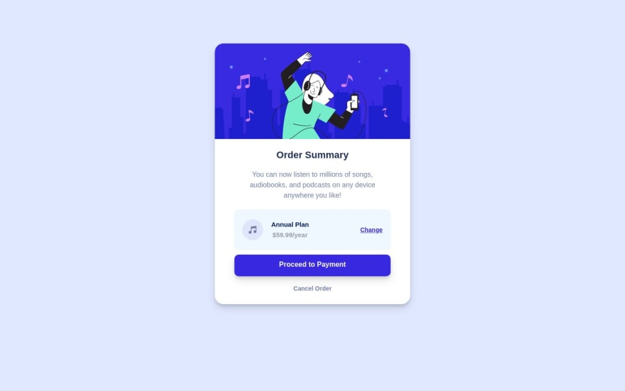
Responsive Order Summary Component using HTML5, CSS3-Flexbox
Design comparison
Solution retrospective
- Please Review on Coding Styles and Rules included in this Project
Community feedback
- @MaximoTzPosted about 1 year ago
Hi how are things? In the part of the .card instead of wanting to center it with a position: relative and a top: 100px better try only with the margin: 60px auto; With that you would do the same but with fewer lines of code. Also, to prevent the image from separating from the border of the card when reducing the size of the page, you can add a maximum width of 40% and that would solve it.
Another thing that I could notice is that in the part of the button the text that is inside is somewhat elevated to be able to center it vertically, you add a line-height with the same value as the height that you placed (50px)
Marked as helpful0
Please log in to post a comment
Log in with GitHubJoin our Discord community
Join thousands of Frontend Mentor community members taking the challenges, sharing resources, helping each other, and chatting about all things front-end!
Join our Discord
