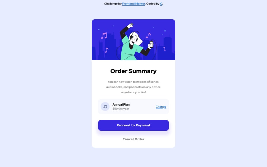
Responsive Order Summary Component using HTML and CSS
Design comparison
Solution retrospective
For the mobile design, should the whole design, including the borders of the component, be inside the mobile viewport when taking the browser controls into consideration? When coding for mobile, is my responsive coding simple enough? This is what took me the most time. Is any of my code too complicated and can be made simpler?
Community feedback
- @Robert-RynardPosted about 3 years ago
Looks really great! Really it's up to you whether you include the whole design in the mobile version. You should be able to just add some margin to the card to help with this. Personally for something like this I prefer to use display: flex; on the body to center the card but the way you used works as well. Great job!
Marked as helpful1@casserole27Posted about 3 years ago@Robert-Rynard thank you!! I did try display: flex; but I did not apply it to the body tag. I will try that.
0
Please log in to post a comment
Log in with GitHubJoin our Discord community
Join thousands of Frontend Mentor community members taking the challenges, sharing resources, helping each other, and chatting about all things front-end!
Join our Discord
