Submitted about 1 month ago
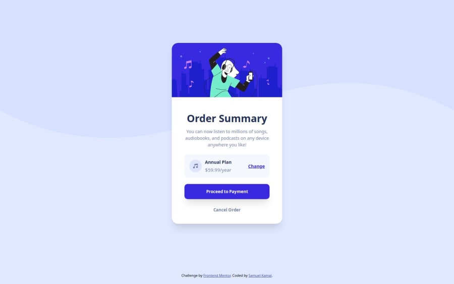
Responsive Order Summary Component using Grid and Flex
@SamuelKamal13
Design comparison
SolutionDesign
Community feedback
- @AdrianoEscarabotePosted about 1 month ago
Hello SamuelKamal13, how are you? I was really pleased with your project, but I’d like to offer some advice that might help:
To prevent the background image from breaking at higher resolutions, we can prevent this in two different ways:
-
Add a
background-repeat: repeat-x;, the image will repeat on the horizontal axis, preventing it from breaking. -
Add a
background-size: 100% 50vmin;, the50vminwill set its height as the page target, and 100% will make it stretch on the horizontal axis.
Feel free to choose one of the two!
The rest is spot on.
Hope it’s helpful to you. 👍
0 -
Please log in to post a comment
Log in with GitHubJoin our Discord community
Join thousands of Frontend Mentor community members taking the challenges, sharing resources, helping each other, and chatting about all things front-end!
Join our Discord
