Design comparison
Community feedback
- @VCaramesPosted about 2 years ago
Hey there! Here are some suggestions to help improve your code:
-
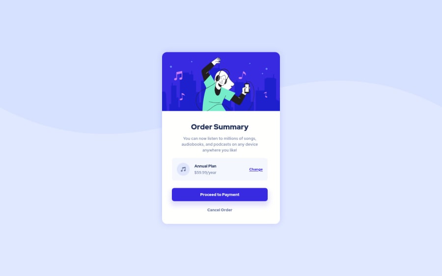
Increase the
widthof the card to better match the FEM example. -
"Cancel Order" was created with the incorrect element. When the user clicks on the button they should directed to a different part of you site. The Anchor Tag will achieve this.
-
Implement a Mobile First approach 📱 > 🖥
With mobile devices being the predominant way that people view websites/content. It is more crucial than ever to ensure that your website/content looks presentable on all mobile devices. To achieve this, you start building your website/content for smaller screen first and then adjust your content for larger screens.
If you have any questions or need further clarification, let me know.
Happy Coding! 👻🎃
Marked as helpful1@zflegle3Posted about 2 years ago@vcarames Thanks for the feedback! I tried to implement a more mobile-first approach with my rock-paper-scissors solution
0 -
Please log in to post a comment
Log in with GitHubJoin our Discord community
Join thousands of Frontend Mentor community members taking the challenges, sharing resources, helping each other, and chatting about all things front-end!
Join our Discord
