

Design comparison

Solution retrospective
I am proud of doing readable and understandable code. I used BEM Methodology for naming block.
What challenges did you encounter, and how did you overcome them?Small challenge was with margins in flexbox block_subscription. I delete them and used flex-grow.
What specific areas of your project would you like help with?Did I use BEM correctly? If no, what should I change? How about responsiveness? Does it readable for you? If no, please, share you opinion!
Any feedbacks are important! :)
Community feedback
- @whawariPosted 8 months ago
Hello Yuliya, Great work! I would like to comment on the structure of your HTML elements and the usage of BEM methodology.
HTML elements structure: you do not need to add extra unnecessary divs, example:
<div> <a class="card-subcription__button">Change</a> </div> Always think of [block and inline level elements](https://www.geeksforgeeks.org/html-block-and-inline-elements/).BEM methodology: You can find all your answers in this article
Here is an updated version of the HTML file structure, try writing CSS using the new HTML structure:
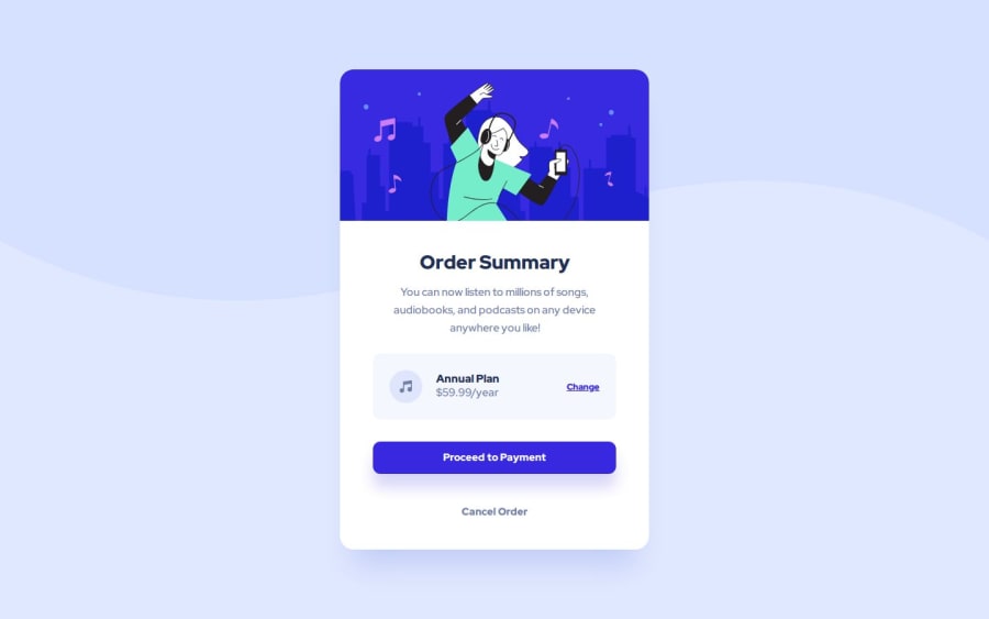
<main class="background"> <article class="card"> <img src="./images/illustration-hero.svg" alt="hero image" class="card__hero" /><h1 class="card__headline">Order Summary</h1> <p class="card__paragraph"> You can now listen to millions of songs, audiobooks, and podcasts on any device anywhere you like! </p> <div class="card__subscription"> <img class="card__icon" src="./images/icon-music.svg" alt="icon music" /> <div class="card__details"> <h2 class="card__plan">Annual Plan</h2> <p class="card__price">$59.99/year</p> </div> <a class="button button--text">Change</a> </div> <button class="button button--contained button--primary"> Proceed to Payment </button> <button class="button button--secondary">Cancel Order</button> </article> </main>Best, Walid Hawari
Marked as helpful0 - @amjadsh97Posted 8 months ago
Hey Yuliya, Great work! I would like to comment on css.
you can wrap .card__text, .card-wrapper__subscription and .card-footer with another element and then add padding 3rem instead of add margin(left and right) for each element.
0


Please log in to post a comment
Log in with GitHub
Join our Discord community
Join thousands of Frontend Mentor community members taking the challenges, sharing resources, helping each other, and chatting about all things front-end!
Join our Discord