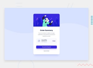
Design comparison
Solution retrospective
If there is anything that should be changed or any tips, feel free to give me any feedback! Trying to learn the best I can! :)
Community feedback
- @MiculinoPosted almost 3 years ago
Congrats on completing the challenge, @Sneflenie!
It looks really nice and very similar to the original design. Also, all the features work as expected and there are no real issues with your responsive design.
Just a few suggestions:
-
The card is missing a box-shadow as the one in the original design
-
The edges of the .plan-info div might be a bit too round
-
Try reducing just a bit the space around the content inside the card
-
On larger screen sizes, the background image doesn't stretch fully to cover the entire viewport width
-
Don't use fixed values for your widths and heights. As a rule of thumb, try to always build your layout around the content you have available.
-
Try to use less of the px unit and more of the relative units such as rem, em, vh / vw, %
Hope this helps. Keep up the great work!
Marked as helpful0@SnefleniePosted almost 3 years ago@Remus432 Awesome, Thank you for the tips! I will try my best to implement them. :)
1 -
- @MunirBerkaniPosted almost 3 years ago
Great work! I love it..
1
Please log in to post a comment
Log in with GitHubJoin our Discord community
Join thousands of Frontend Mentor community members taking the challenges, sharing resources, helping each other, and chatting about all things front-end!
Join our Discord
